Data Visualization
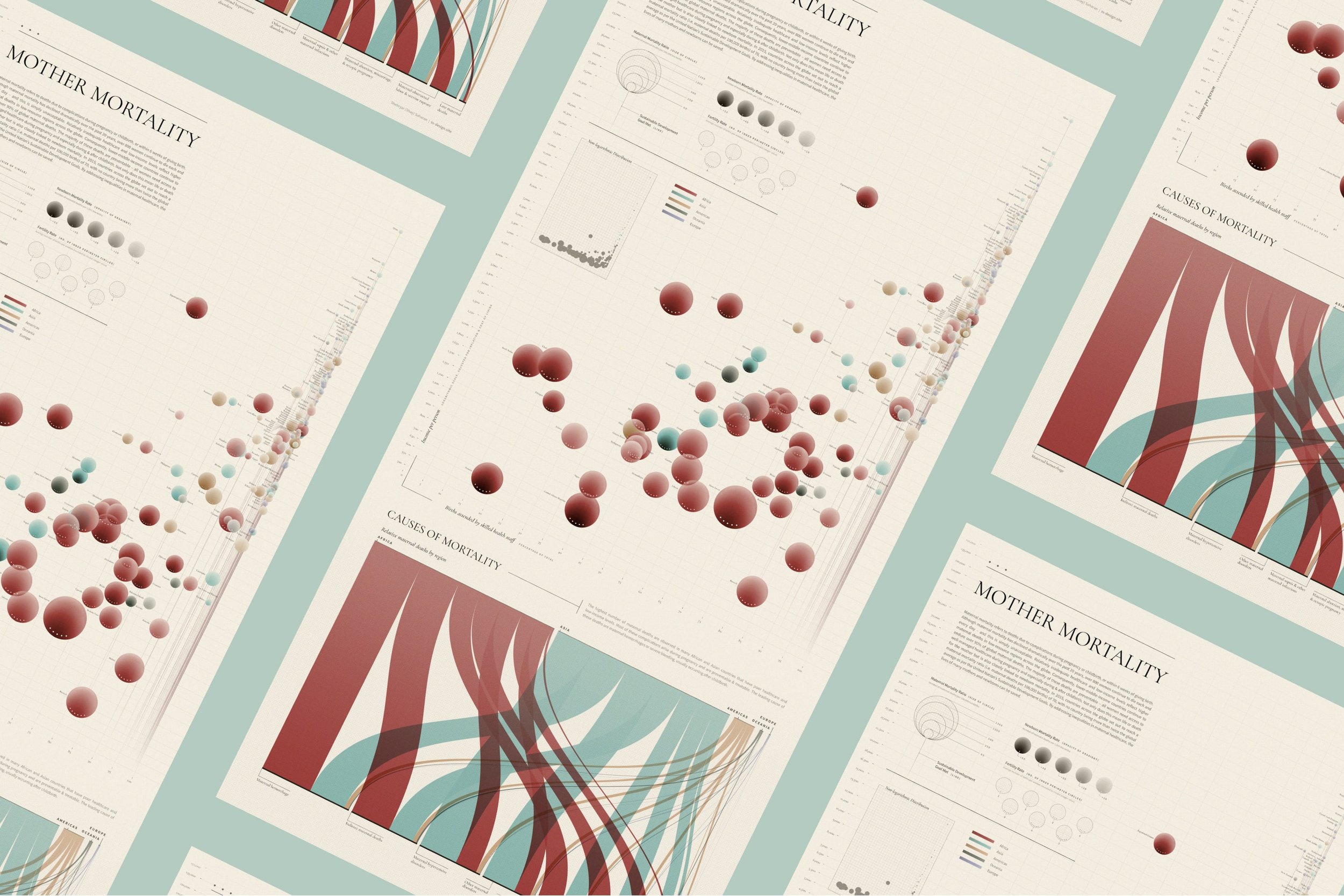
This data visualization focuses on the maternal mortality rates across the globe and sheds light on factors that play an important role in its prevalence, as well as causes of death.
After conducting research in this subject area, I found that income level and births attended by skilled health staff play a major role in defining this mortality rate; consequently, these 2 variables were encoded by the axes of the main visualization (Bubble Chart). Other related variables included the fertility rate and newborn mortality rate. A second data visualization (Sankey Diagram) was included to relate the global region to cause of maternal mortality. The final data visualization included a total of 9 variables: Maternal mortality ratio, Income level, Births attended by skilled health staff (% of total), Country, Global Region, Fertility rate, Newborn mortality rate, SDG goal met? (Target 3.1 of the UN Sustainable Development Goals (SDGs) is to reduce the global maternal mortality ratio to less than 70 deaths per 100,000 live births), & Cause of death.


